Workspace recipes
Use schema 10 or later for the screens below. The pictures on this page come from the
office sample: run gozen run examples/office/game from an engine checkout to
play a small app team’s sprint (six people, three rooms; the art claims no copyright (CC0 1.0), listed in examples/office/ASSETS.md). The smaller test fixture in
e2e/atago/fixtures/workboard uses only a geometric picture. See
planning for the calendar and rules.
A workspace can combine a directory, a data-authored calendar and a small burnup strip. All availability conditions, date labels and choices belong to the game data. Browsing controls should only change view variables, not advance the calendar.
screens:
  studio:
    title: Studio
    kind: workspace
    view:
      fullscreen: true
      burnup:
        bounds: [380, 610, 500, 66]
        compact: true
        title: Progress
        total: Scope
        planned_label: Planned
        observed: Reported
    entries:
      - label: Potter
        bounds: [32, 180, 250, 350]
        portrait: true
        icon: portraits/potter.png
        muted: '!entity.potter.available'
        text: '{entity.potter.schedule}'
Declare the entity and public observations in planning. Portrait mode centers a
large face above the label. Muted portraits retain their action so an unavailable
resident can still be inspected. Compact burnup uses the same public observations
as the full chart. Bounds are logical pixels and must be at least 120 by 48.
State-dependent conversations #
Use ordinary event if branches to select a line from current authored state.
Order overlapping conditions explicitly: a low-energy greeting can take priority
over a return greeting. Keep relationship values in variables or hidden planning
attributes; display observed replies and dates rather than the hidden value.
Opening a profile should not call an event that changes that relationship.
events:
  greeting:
    do:
      - if: var.energy < 20
        then: [{say: {who: scout, text: "Let us take a break."}}]
        else:
          - if: flag.returned
            then: [{say: {who: guide, text: "Welcome back."}}]
            else: [{say: {who: scout, text: "Ready to explore?"}}]
Workspace entries use ui.material.surfaces.card when materials are enabled,
including large information panels. Disable materials to use the solid fallback.
Ordinary entry portraits scale up to a 36-unit radius, constrained by row height;
use taller rows when facial expressions carry information. portrait: true
continues to allocate the larger profile area.
Photo cards #
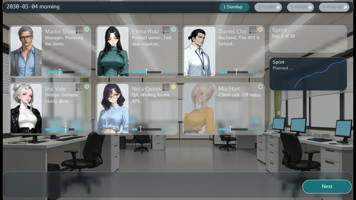
A bounded workspace entry may set picture (schema 10). The picture fills the
card above a caption (the label and two text lines) and is cropped to cover the area, so supply crops
whose aspect matches the card. Use it for profile cards or a gallery of visitors;
keep the cropping itself in the authored assets. The bounds need a height of at
least 120 so the caption keeps its own row.
entries:
  - label: Visitor
    text: Brings clay on Fridays.
    bounds: [32, 150, 300, 420]
    picture: pics/visitor-card.png
    do: [{set: {var.visitor_open: true}}]
Reading and pressing #
A workspace keeps what is read apart from what is pressed (schema 10). Give a
bounded entry style: plate for information: a frosted board without an edge,
a shadow or a focus stop. Give it style: button for an action: a pill with a
bright edge, its label centered and an accent ring when focused; write marks
such as a chevron into the label. The checker refuses a plate with do or a
destination and a button without one. Entries without a style keep the
ordinary card. Put buttons in fixed places, such as the end of a list for paging
and the bottom band for actions, so the player learns where pressing happens.
Ticket cards #
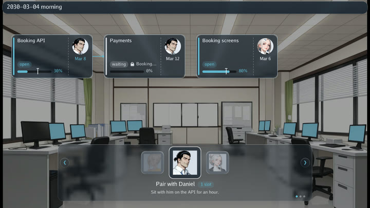
ticket draws a bounded entry as a work ticket. The label is the title and
icon the portrait of whoever holds it.
entries:
  - label: '{activity.fire.name}'
    bounds: [340, 200, 290, 150]
    icon: '{entity[activity.fire.assignee].portrait}'
    destination: ticket
    ticket:
      due: '{activity.fire.deadline}'
      state: '{activity.fire.observed >= activity.fire.effort ? "done" : "open"}'
      planned: '0.5'                                    # expected by now, 0..1
      progress: 'activity.fire.observed / activity.fire.effort'
      behind: 'planning.date > activity.fire.deadline'
      blocked: 'activity.glaze.observed < activity.glaze.effort'
      after: ['{activity.glaze.name}']
The bar fills to progress and carries a mark at planned. behind colors the
stripe, the bar and the due date as late; blocked grays them and shows a lock
before the names in after. When another visible ticket card has a label equal
to a name in after, a line joins the two cards: a short arrow between
neighbors on one row, otherwise a line over their tops. Empty names are dropped,
so a repeated entry can list a fixed number of optional prerequisites.
Carousels #
Bounded actions that share a carousel name form one rotating selector: square
boxes with the entry picture (or the first letter of the label), the chosen
box large in the middle and its neighbors smaller and fainter. Left and right
turn it, as do the arrow buttons and a click on a side box; OK or a click on the
middle box confirms. Up and down treat the whole carousel as one stop. Under the
middle box are its label, cost as a chip, and its text. The middle box takes the
band height less 86 for the caption, from 48 up to 180.
entries:
  - label: Fire
    carousel: tools
    picture: icons/fire.png
    cost: 1 slot
    text: Fire the kiln.
    bounds: [320, 500, 928, 196]
    do: [{call: fire}]
  - label: Glaze
    carousel: tools
    picture: icons/glaze.png
    text: Glaze a bowl.
    unavailable: 'var.kiln_busy'
    reason: The kiln is busy today.
    bounds: [320, 500, 928, 196]
    do: [{call: glaze}]
A screen has at most one carousel, its members share their bounds, and the
bounds need a height of at least 120. The carousel draws its own band, so the
screen’s usual bottom band is left out. unavailable works on any bounded
action: the control stays visible and faded, confirming it does nothing (the
trace records screen_refused), reason replaces its text, and a script pick
skips it while look lists it as disabled.
Dragging and dropping #
On a full-screen surface a bounded entry with drag is carried, and one with
drop is a place to drop it on (schema 10). drag is interpolated; its text is
the value handed over (an empty value is not carried). drop names a new
parameter: only a drop runs the place’s do, with arg.<name> bound to the
carried value as a string. accepts, with that binding, refuses the drop while
it is false, and hint is a short line shown on the place while something is
carried.
entries:
  - label: '{activity[arg.id].name}'
    each: {param: id, items: [glaze]}
    bounds: [40, 150, 280, 150]
    drag: '{arg.id}'
    ticket: {due: '{activity[arg.id].deadline}', progress: 'activity[arg.id].observed / activity[arg.id].effort'}
  - label: Potter
    icon: '{entity.potter.portrait}'
    bounds: [420, 150, 300, 140]
    drop: job
    accepts: 'activity[arg.job].assignee != "potter"'
    hint: 'Give {activity[arg.job].name}'
    do: [{plan: {op: assign, activity: '{arg.job}', entity: potter}}]
- Mouse and touch: press a carried entry and move it 6 pixels to drag a translucent copy under the pointer; let go over a place that takes it to drop, anywhere else to put it down. Press and let go without moving to pick it up; then press a place to drop, the carried entry again or empty space to put it down, or another carried entry to carry that one. Other controls still work while something is carried.
- Keys and pads: up and down stop on carried entries and places too. OK on a carried entry picks it up, OK on a place drops. Cancel puts down what is carried and leaves the screen open.
- While something is carried, the carried entry is lifted with an accent ring, a place that takes it gets an accent edge, a place that refuses it is faded with a cross, and each place shows its hint.
- A drop runs the place like any action (unavailable refuses it, the screen
waits for the action and refreshes). The trace records
screen_carry,screen_dropandscreen_refusedwithscreen,entryandsource(the carried value). A refresh keeps the carried entry by its entry and row arguments, and puts it down when it is gone. - A script picks carried entries and places by label; a place is disabled while
nothing it takes is carried, and
lookaddsheld, the label of the carried entry.drag X Y TO_X TO_Ypresses, moves over eight ticks and lets go.
The carried value is not in scope in label, text, icon, when, muted,
unavailable or reason, which are drawn while nothing is carried. A carried
entry has no do, destination, carousel, target, drop or peek; a place
needs do and has no destination, carousel, target or peek.
Peeks #
peek opens interpolated text in a small glass panel beside a bounded entry
when it is pressed, without leaving the screen or running anything. A day plate
of a calendar is the usual case:
- {label: '7/31', style: plate, peek: 'Kiln maintenance in the evening.', bounds: [800, 150, 160, 80]}
Pressing it again, pressing elsewhere or cancel closes it; the press that closes
it does nothing else. The panel has no edge or focus ring, so it reads as text.
OK opens it from the keys. A script pick opens it and look adds peek, the
open text. The trace records screen_peek with open. An empty peek is not one.
Status dots #
dot draws a small colored circle in the top-right corner of a bounded entry:
an interpolated #rrggbb (schema 10). Use it beside a word, such as a condition
on a face card, never as the only sign of the meaning. An empty or unreadable
color draws nothing.
- {label: Ann, style: plate, text: 'Tired', dot: '{var.ann_tired ? "#e8a07a" : "#7fc8a9"}', bounds: [32, 150, 200, 120]}
Busts and meters #
bust draws a head-to-chest crop of a standing picture in the left part of a
bounded entry, in place of the round icon (schema 10). The picture’s face box
(assets/faces.json) places it: width is the share of the entry’s width
(default .4), top where the face’s top sits and face how tall the face is,
both as fractions of the crop’s height (defaults .12 and .3). A muted entry
veils the crop in gray. The label and text move to the right of it.
meter draws the same progress bar as a ticket card along the bottom of the
entry: progress fills it (0..1), planned marks where it should be, and
behind colors it late.
- label: Ann
  style: plate
  bust: {picture: 'portraits/ann/base.png', width: .4, top: .14, face: .42}
  meter: {progress: 'var.ann_done', planned: 'var.ann_plan', behind: 'var.ann_done < var.ann_plan'}
  muted: '!var.ann_here'
  bounds: [32, 150, 296, 222]
Signs #
sign draws a small square picture in the top-right corner of a bounded entry,
left of its dot, such as where a person is today (an office, a house, a moon
for a day off). It is an interpolated path (schema 10).
Messages #
The message command queues a chat message that asks for a decision:
- message: {who: ann, text: 'The kiln is late. Shall I stay tonight?', event: kiln_late}
event is a parameterless event, usually a choice; a message is never only
read. tag puts a short mark on the notification and the bubble, such as DM
for a one-to-one message. Queuing does not stop the event. On a full-screen surface the oldest
message shows as a notification in the top-right corner below the header: the
speaker’s square face, the name, the first line and the count of the others.
Pressing it, or the inbox key (I), takes it from the inbox, shows a bubble in
the upper middle of the screen (the speaker’s crop and the whole text) and runs
the event on that screen as an entry action does, its choice under the bubble.
When the event ends the bubble closes and the screen is back. Unopened messages
are saved (inbox in the state, at most 50, the oldest falling away). A script
picks the notification by its label (the translated word for message, a colon and the name); look adds inbox and,
while one is open, message; the trace records message_open. A video call
screen shows no notification.
Under ui.material the notification, the bubble and a screen guide’s line
stand on a nearly opaque card (at least 0.94, whatever the card’s opacity), so
the text of the screen under them does not show through behind theirs.
Call view #
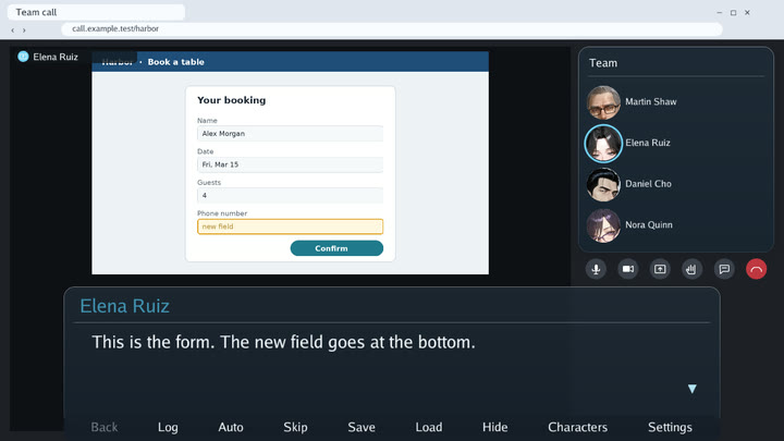
call_view changes only how a video call looks, without changing any state,
so an introduction that must leave the state alone can still show it:
- say: {text: (Ann turns her camera on.), ensemble: studio}
- call_view: {camera: {who: ann, on: true}}
The camera override lasts for the call’s lines and ends at the first line outside a call. A narrated line of a call keeps the last participant who spoke on the stage; a line by the caller (a speaker who is not a participant) keeps it too and lights the caller’s own view.
call_view: {share: {who, picture}} puts a shared screen on the call’s stage,
as when a participant presents in a video call: the picture (under assets/)
is drawn whole above the message window in place of the speaker’s view, with
the sharer’s name and the share mark in its upper left, and every participant
stays in the strip or the side column, the speaker’s view glowing as usual. It
shows only on a call the sharer is in. An empty picture ends the sharing, and so
does the first line outside a call.
- call_view: {share: {who: ann, picture: share/plan.png}}
- say: {who: ann, text: This is the plan., ensemble: studio}
- call_view: {share: {who: ann, picture: ""}}
A choice right after a line of the call with muted: {seconds, do} gives the
player the floor without forcing them to speak: the call’s mic control turns red
and struck through, and only an Unmute button shows. OK or a click on the
button, or a click on the mic, brings the answers; left muted for seconds, the
muted do runs instead (see Events).
Full call #
A call can fill the screen and show its lines in the ordinary message window laid over it:
view:
  call:
    address: call.example.test/studio
    layout: full        # the browser maximized over the whole screen
    captions: overlay   # the message window over the call, down to the lower edge
    others: side        # the participants not speaking as round faces in the side column
    others_title: People
    window_opacity: 0.8 # a deeper window over the moving pictures
The window keeps the top and the width it has elsewhere, so lines wrap and
page as in every other scene; only its lower edge reaches the screen’s. The
stage runs under the window, and the person on it is framed in the part above
the window’s top. The side list, the controls and the self view stand above
the window. others: side also works without layout: full: the list takes
the place of the chat transcript, and the stage takes the strip’s room. A join
or a leave shows as a face coming or going; an authored chat.reaction shows
under the name. A call of two (one participant besides the self view) folds
the column for every line, so the layout does not change from line to line:
the stage widens to its edge, the controls stand in a slim column at the
right, and while the caller takes the stage (self_stage) the participant
stands in the small view.
A self view that is a picture or an actor who is not a guest (self: me.png)
stands on the plain tile of the call; self_backdrop: room.png puts a picture
behind it, small and on the stage, as an entity’s backdrop is behind an entity
(an entity’s self view keeps its own backdrop, a guest’s its
guest_backdrops). A person on camera is framed by the face found in the
picture; when the opaque part above the face (mostly hair, but a hat or a
raised hand counts too) would rise above the top of the view, the face moves
down a little and, if that is not enough, shrinks, so it stays inside. A
picture whose opaque part reaches its own top edge is drawn cut there and is
framed as before.
An event of lines shared by several calls names no ensemble in its lines;
the call that calls it names the screen instead, and the lines of the called
event, and of the events it calls, show over that call:
- choice:
  - label: Talk about the scope
    do: [{call: {event: scope_talk, ensemble: client_call}}]
Face shape #
Faces on planning screens are round badges by default. ui.face_shape: square
cuts them as rounded squares (the same face close-up), and a screen’s
view.face_shape (round or square) overrides it for that screen. A video call
(view.call) always keeps round faces, as call apps do.
Flows #
flows in game.yaml puts full-screen surfaces in a fixed order, such as
checking progress, then people, then choosing actions (schema 10).
flows:
  day:
    steps:
      - {label: Progress, screen: board_progress, enter: ask_about_late}
      - {label: People, screen: board_people}
      - {label: Actions, screen: board_actions}
    restart: '"" + planning.date + planning.phase'
    skip: 'var.runs > 0'
    next: 'Next ›'
- A step band in the header shows the steps: the step shown in the accent, the
finished ones with a check (press one to go back), the ones not reached faded
with a lock (they cannot be pressed unless
skipholds). - Every step but the last has a next action, 176 by 48 at the bottom right (16
from the right, 24 from the bottom, left of the tabs when there are tabs). It is
drawn over the entries and takes clicks first, so keep that corner free. It
finishes the step and replaces the screen with the next one without stacking,
as a tab does.
nextis its label; left out it is the built-in label (Next › in English). - Opening a step not reached yet, by
openor otherwise, opens the current step. Whileskipholds, every step opens. restartis a pure value; when it differs from the value the progress was made under, the flow starts again from the first step, passing over the steps whosedonealready holds or whosewhenleaves them out.enteris a parameterless event run over the step’s screen the first time it shows under each restart value, also whenskipopened it.- The progress is saved with the game (
flows.<name>:reached,key,entered), so saving, loading and rewinding keep it. The trace recordsflow_nextandflow_enter. A script picks the next action by its label and a step by its label (“2 People”);lookaddsflow,stepandreached(counted from 1). Up and down reach the next action and the steps after the entries.
A step is a parameterless full-screen surface and a screen is a step of one flow only. Flows have 2 to 10 steps.
Steps that time finishes, such as the parts of a day, are held, and steps that
apply only on some days have a when:
flows:
  day:
    steps:
      - {label: Calendar, screen: today}
      - {label: Meeting, screen: standup, when: '!planning.closed'}
      - {label: Work, screen: desk, hold: true, done: 'planning.phase != "morning"', when: '!planning.closed'}
      - {label: Evening, screen: home}
    restart: 'planning.date'
- A held step (
hold: true, withdone, not the last step) has no next action: only itsdonefinishes it. Once finished, it and the steps before it are not opened again under the same restart value (opening one opens the current step) and cannot be pressed in the band. - After an action on a step screen, or when it shows again because a screen over it closed, a screen that would no longer open as itself (a held step finished, a new restart value) is replaced by the step that opens, without stacking.
when(a pure condition; not on the first step) keeps the step in the flow while it holds. Left out, the step is passed over as if finished and is not shown in the band, which numbers the steps shown.
First-visit guides #
A screen’s guide walks a new player through it once, in a character’s voice,
instead of permanent instructions on the screen (schema 10).
screens:
  board_progress:
    entries:
      - {label: 'Timeline ›', style: button, mark: timeline, bounds: [32, 620, 200, 38], do: [...]}
    guide:
      when: 'planning.phase == "morning"'
      steps:
        - {who: lead, text: 'Reports first. The line under the plan is where we really are.'}
        - {who: lead, text: 'Fine. On to the people.', focus: [next]}
- The lines show one by one in the notification corner (another corner when a lit place lies under it), with the speaker’s square face and name. The chat notification waits until the guide is finished.
focusnamesmarks of the screen’s bounded entries (rows of aneachmay share one) ornext, the flow’s next action. The screen is veiled except the lit places, which are ringed; any press elsewhere, cancel, save and load are refused. The line goes on when a lit place runs its action. Withuntil, it goes on when the condition holds instead (a drag, a carousel turned and used).- A line without
focusis pressed anywhere, or with OK, to go on. - Marks keep a guide independent of the layout: move or rebuild the entries, keep the mark.
- The finished guide is recorded as
guide:<screen>in gallery.json and never shows again, in any later play. Scripted, replayed and automatic plays skip guides unless the script saysguides on; the trace hasguide,guide_blockedandguide_done.
view.header_face (an interpolated picture path) puts a small square face crop
after the date, before the header text, and view.header_tint (an interpolated
#rrggbb) a ring around it: a state shown by a face, not a word.
Light timelines #
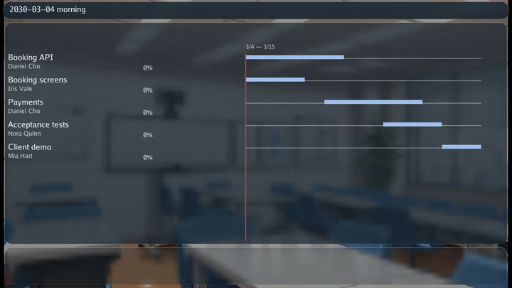
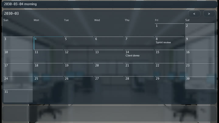
A grouped timeline on a view.light surface is drawn on a frosted board: pale
gray days off, light month lines, the planned span filled pale blue, the report
deep blue, the shortfall from the planned position orange, cancelled work gray
hatching, the planned mark kept, and the red today line labeled with the word for today. Timelines
on other surfaces are unchanged.
Scene ordering and voice diagnostics #
The planning author guide introduces plain
lists before positioned workspaces, and documents reservation after,
exclusive, and when declarations. It also explains optional language-keyed
actor speech checks, their lexical limits, minimum call dimensions, and save
migration compatibility. Activity prerequisites and scene prerequisites are
separate namespaces; neither requires manually maintained bookkeeping flags.
Entry layout contract #
Ordinary bounded entries (including style: plate) render picture,
picture_fit, bust, meter, dot and sign. Buttons render their label,
text and tone; use a separate plate for pictures and measurements. Tickets
render their own progress bar and optional icon. Carousels accept pictures and
busts, including contain, but not meters, dots or signs. gozen check rejects
unsupported decorations instead of silently hiding them.
Inspect pictures and carried cards #
In a script, run look after opening a screen or picking up a card. The JSONL
record reports on, controls and disabled; picture-bearing views also
report pictures, while drag and peek views report held and peek when
active. Assert these records as well as state changes. shot captures pixels
only in run, not in sim script.
Profiles and quick controls #
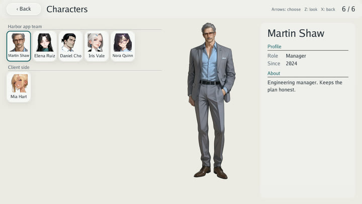
Use ui.profile_book: {layout: grid} for a grid of unlocked character profiles.
Profiles still use their authored unlock conditions; changing layout does not
unlock them. Author runs with --dev reveal every profile for inspection;
run without it to check unlock conditions. Use ui.quick_menu: below to place dialogue controls
below the message window; inside places them within it. Use ui.novel_window to position the window. Phase
looks belong to the calendar’s presentation configuration, so changing a phase
can change the background without an event repeating presentation commands.
Check the schema for each field’s default and allowed values.
Recording and performance #
The capture recipes are in docs/images/manifest.yaml, using the office
sample (examples/office). Run make docs-images under Xvfb on Linux. Full-screen saves require
a completed event or checkpoint: close the workspace before saving a free-standing
screen session. The workboard E2E closes, saves, starts a second process and
reopens the flow. Guide completion is gallery state, separate from saves;
scripted runs opt in with guides on but do not persist gallery unlocks.
Overlapping materials #
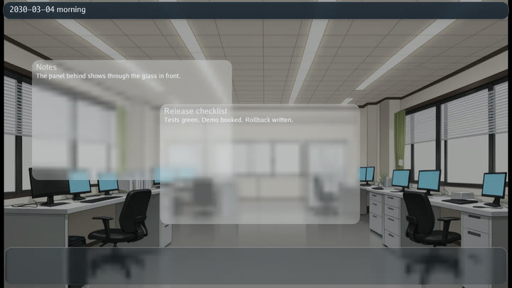
Panels sample the current layer, including earlier panels and their content.
The fixture’s materials screen deliberately overlaps two plates. Use
ui.material.surfaces to choose mica, acrylic or glass by surface role.
ui:
  profile_book: {layout: grid}
  quick_menu: below
planning:
  calendar:
    looks:
      morning: {label: Morning, time: '09:00', color: '#ffe8c0', wash: 0.15, card: true}
quick_menu: inside moves controls inside the window. Phase looks tint the
workspace and can show a transition card; they do not change the calendar rules.